WEEK 3 - Marketing tips from magazines? (aka why print isn't dead)
Hey HOMwork friends, happy Friday!
If this is your first time joining us, you can take a peek at all of the previous assignments in our Challenge Archive. No pressure to complete them, but if you're the kind of person who loves extra credit, go for it!
Remember the first challenge this year when I had you write out everything you were interested in? One question that kept coming up was, "How do I choose which interests in my long list to focus on?"
Well...this week’s assignment will help you answer that question!
One way to help you curate your interests is to think of your brand as a magazine. Now, before you go saying “print is dead”, there’s a lot we can learn from these publications, specifically the way they structure their content.
Think of a health magazine. The overarching theme is health but under that umbrella, there are more specific sections: exercise, mental health, diet, etc.
This week, I want you to try thinking of yourself as a magazine (what is your main focus/theme) then choose 5 categories that fit under that umbrella (your sections). If you're more of a TV person, think of yourself like the Food Network and the categories as the shows.
Tip: When you're deciding on your categories, try to choose topics that you personally can't get enough of. Things you could go on and on and on about.
OMG MORE FREE BRUSHES!
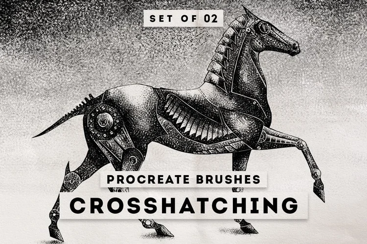
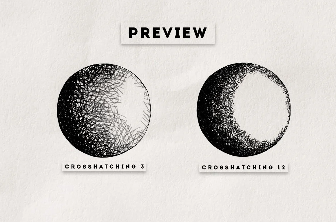
I mentioned this in last week's email, but DesignCuts will generously be offering all HOMwork subscribers two FREE Procreate brushes every week :)
<< Click here to download this week's sweet crosshatching brushes!
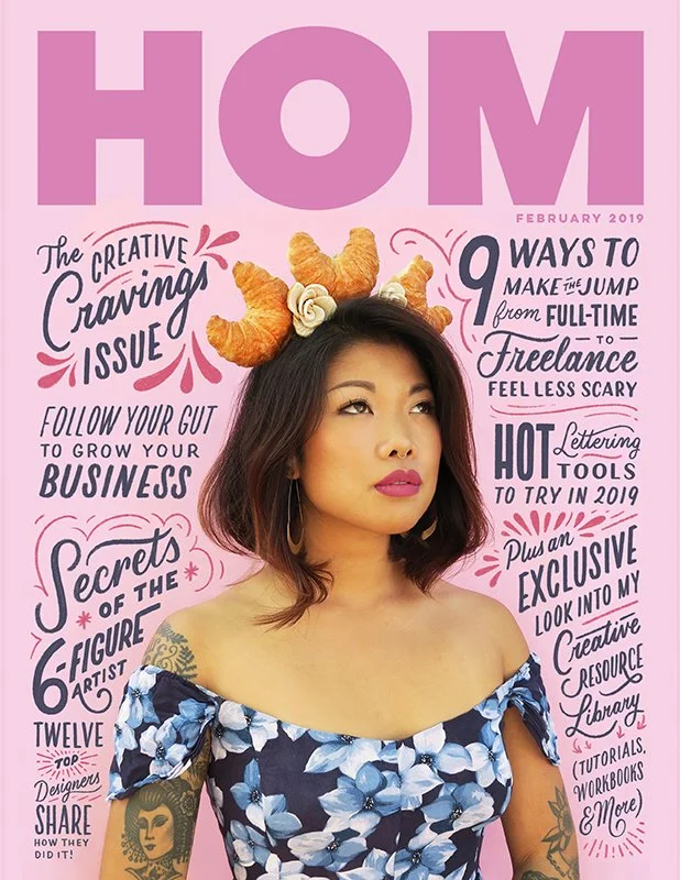
Your assignment: Imagine you or your brand is a print magazine and design it’s February 2019 cover.
Consider everything a magazine cover needs to convey to the viewer from the broad genre to the specific think pieces. What would your magazine’s sections be? What types of articles would be inside, and what would the catchy cover lines be (aka old-school clickbait)? Then illustrate or letter the cover in your style!
Caption idea: Write the brand statement for your magazine. Just a few sentences that convey to your audience what you're all about, touching on the genre and 5 sections within that!
Bonus Assignment: Take one of your cover lines and bring it to life! Write the actual article and turn it into a blog post or create the artwork for a cover story. This is a great way to add extra work to your portfolio in the categories you're interested in!
If you need some editorial inspiration follow @coverjunkie and check out The Society for Publication Designers for some historical reference. Here are some examples of covers I've done too: Baltimore Magazine, Time Out New York, and Washingtonian.
Make sure to tag me @homsweethom and use the hashtag #HOMwork so I can see your creative voices blossom. I'll be sharing my faves in Stories all week!


